
Design System for SaaS
JDA (now rebranded to Blue Yonder) is a leading American software and consultancy company providing comprehensive supply chain management, manufacturing planning, retail planning, store operations, and category management offerings. Its vast portfolio, built through strategic acquisitions including Yantriks, Blue Yonder, RedPrairie, i2 Technologies, Manugistics, E3, Intactix, and Arthur, serves over 3,000 corporate customers globally. My engagement with JDA coincided with a pivotal period of expansion and integration, focusing on a critical initiative to bring visual consistency and a unified experience across its diverse software ecosystem.
Adobe Illustrator
Adobe Photoshop
Axure
Miro
My Role
I joined JDA during a significant transition as the sole Visual Design Practice Lead. Following numerous acquisitions, the company faced a substantial challenge: its portfolio of over 100 applications suffered from widespread usability, brand, and visual inconsistencies. My core responsibility was to champion and infuse the importance of visual consistency across JDA's entire product suite. I was specifically tasked with spearheading the creation of a new visual style and a comprehensive design system for the Next-Generation SaaS and Digital Edge Solutions, collectively branded as Luminate, which spanned both desktop and mobile applications.
Parallel to this, there was a clear need to refresh the existing design system for many older, legacy applications. These wouldn't undergo a full redesign but required a cohesive "facelift" to align with the new corporate aesthetic. My ambition was to build a design system that would be easily integrated by development teams, many of whom utilized Google's technologies, thus leveraging Material Design as a foundational template. I aimed for a clean, mature aesthetic while meticulously crafting a unique visual identity for JDA. A significant aspect of this involved pioneering a "soft-branding" approach for different applications within the Luminate solutions – a concept enthusiastically embraced by JDA's marketing team. Throughout this intricate process, I placed immense effort on ensuring both flexibility and uncompromising accessibility standards.
As the sole visual designer for this colossal undertaking, I led the Luminate Design System initiative, collaborating closely with a distributed team of 12 UX Designers across the US, India, and Canada. Apart from the Luminate logo, all visual elements within the system were entirely my design.
Challenge and Goals
The scale of JDA's product portfolio post-acquisitions presented immediate and complex challenges:
- Pervasive Inconsistency: Over 100 applications, each with its own legacy, resulted in significant UX, visual, and branding inconsistencies.
- Dual Design System Mandate: While the primary focus was on the new Luminate SaaS solutions, there was also a critical need to uplift legacy applications to match the evolving brand aesthetic, leading to the development and maintenance of two distinct design systems concurrently. This meant supporting both initiatives as the sole visual designer.
- Accessibility Deficiencies: The existing design system for older applications was not compliant with WCAG standards for text or colors, posing a significant accessibility gap.
- Resource Scarcity: Operating as a single visual designer supporting a vast organization (with 500+ developers and 12 UX designers) demanded highly efficient processes and strategic leverage of existing frameworks.
Our overarching goals were clear:
- Unify the User Experience: Establish visual consistency and a cohesive brand presence across all JDA applications, new and old.
- Drive Scalable Design: Create a robust design system that could be easily adopted, maintained, and evolve with future product development.
- Enhance Accessibility: Ensure all new and updated visual elements met WCAG accessibility standards.
- Empower Teams: Provide clear guidelines and accessible tools for designers and developers, fostering collaboration and reducing design debt.
- Introduce Strategic Flexibility: Implement a "soft-branding" approach to allow for application-specific identities within the overarching JDA brand, a critical aspect for customer adoption and internal brand alignment.
Discovery and Research
My discovery phase began with a thorough review of the existing (old) design system. Working in close collaboration with the UX team, I led the assessment of potential improvements, particularly focusing on the critical need for WCAG compliance.
I initiated a structured stakeholder engagement process, collaborating with UX designers to review existing wireframes. These wireframes became crucial archetypes from which core components could be designed. To build a robust content strategy, I partnered with a UX designer to conduct a comprehensive component breakdown, providing a clear overview of the common components frequently utilized by the UX team across applications. This collaborative effort was instrumental in identifying patterns and informing the initial visual style guide.
I then established a formal process for the development of the new SaaS design system, defining clear contribution guidelines and review cycles. This process was critical for ensuring cross-functional alignment and was subsequently approved by the UX Director, Project Managers, and the VP of Engineering and Product, solidifying buy-in from key leadership.


Design Approach
My approach was iterative and collaborative, balancing vision with practicality. Given our lean resources, I strategically adopted Google Material Design as a base framework. This accelerated development while allowing me to focus on crafting a custom visual identity aligned with engineering constraints.
While contributing to the development of the new visual system for our Luminate SaaS products, I also led the evolution of the legacy design system through phased updates. These included new color palettes, typography, and refreshed components, all reviewed for accessibility to ensure a unified user experience across both old and new interfaces.
Legacy apps varied widely in structure and tech stack, so I tailored updates on an application-by-application basis. This granular work was essential, as customers often used legacy and modern solutions side by side. Leadership prioritized brand continuity, and my direct involvement ensured a cohesive visual language across the entire product portfolio.
Collaboration with UX was constant. When new components like “Product Distribution” introduced visual weight, I made complementary adjustments to maintain focus and usability, reflecting a user-centered approach.
I also led the creation of a internal design system website, evolving documentation from static PDFs into a live, developer-friendly hub featuring reusable components, mobile-ready patterns, and visual guidelines for complex UI like data visualization, co-developed with a UX specialist. This platform became a widely adopted resource across JDA.
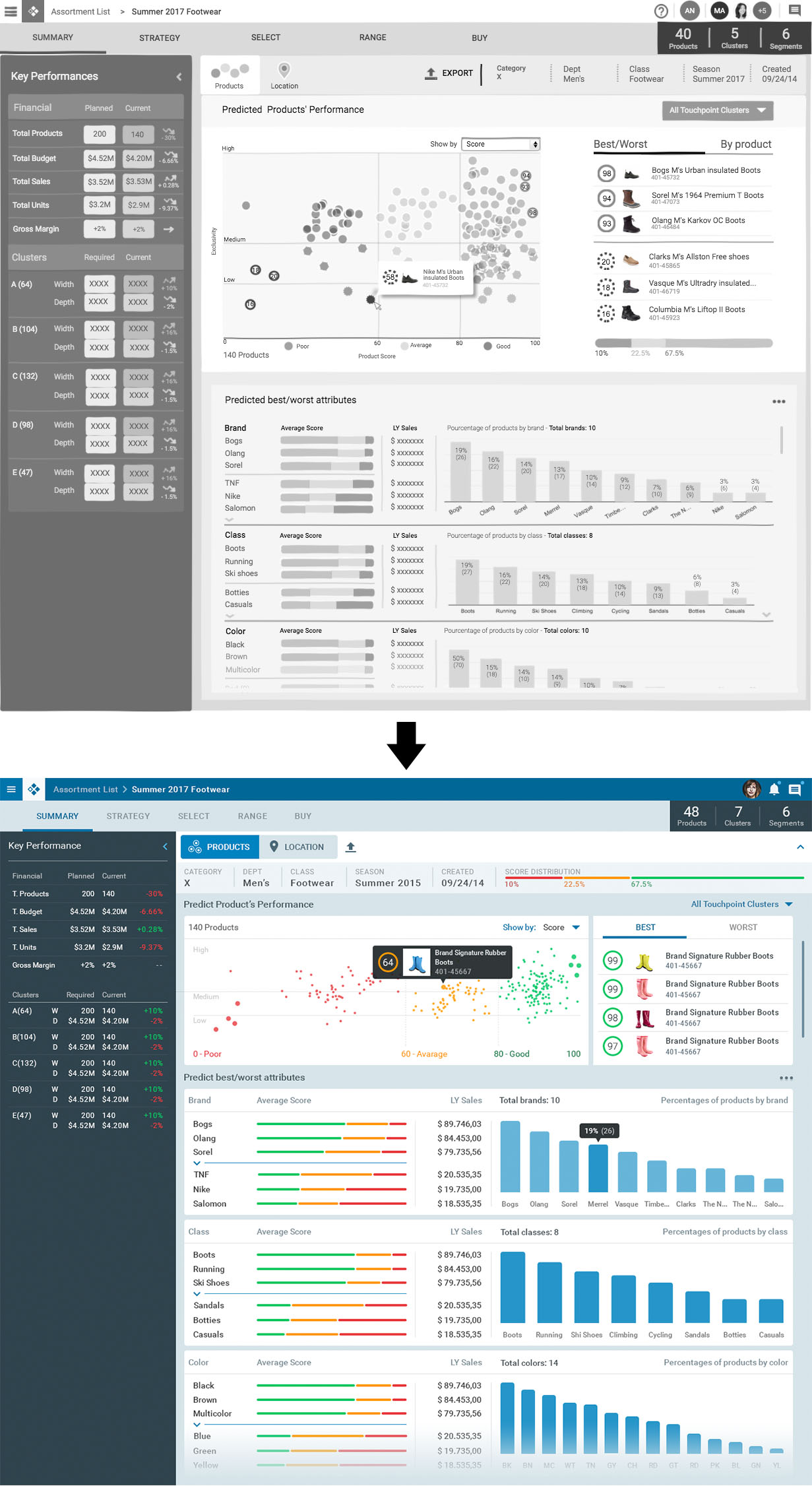
Translating UX into UI
In the example below, a wireframe created by UX designers underwent a visual design pass by me. I applied the company’s brand system and refined the visual hierarchy to ensure consistency across related screens.
In many cases, the original layout required adjustments to align with the structure and logic of other parts of the product, something not always accounted for in the wireframes. In some instances, small fonts or visual clutter made the screen unusable, and I had to fully rework the design to create a coherent and functional layout.
During this process, I carefully considered the role of text, images, and icons and ensured interactive elements had appropriate sizing and spacing for usability, including accessible hit zones for mouse and touch interactions.

Interaction and Visual Design
While the project scope involved limited direct interaction design due to the Material Design foundation, my primary focus was on establishing a cohesive and visually distinctive aesthetic for the Luminate ecosystem and ensuring its flexible application. This was my first opportunity to lead the visual direction for an application design system at this scale. Partnering with a supportive UX Director, I embraced the challenge with enthusiasm.
I meticulously crafted the new visual style for Luminate, ensuring a clean, mature, and contemporary look that balanced distinctiveness with professionalism. Key areas of focus included:
- Color Palettes: Developed a comprehensive, brand-aligned, and WCAG-compliant color system.
- Typography: Defined consistent scale and hierarchy for readability and rhythm.
- Iconography: Created a cohesive, scalable, and intuitive icon set.
- Component Styling: Adapted Material Design components into JDA’s unique visual language, detailing states and spacing for buttons, inputs, cards, and tables.
- Layout & Grid Systems: Established principles for balance and responsiveness across screen sizes.
A key challenge was applying this new visual language to wireframes from UX. I iterated continuously, transforming functional blueprints into archetypal screens that upheld UX integrity while adding fresh visual appeal. I ensured the visual design guided user focus subtly without distraction.
The detailed visual specifications I created empowered over 500 developers to implement the system consistently across many applications.


Special Focus
The Soft Branding Initiative
I spearheaded a soft-branding initiative to balance customer customization with preserving JDA’s identity. Customers often rebranded software by removing the JDA logo, which was a challenge for the company.
I collaborated closely with product managers, marketing, and the core branding team. Initially, there was some skepticism from designers about involving branding, but I built trust by focusing on a solution that worked for all parties. This led to full confidence in my ability to develop the visual guidelines.
Inspired by JDA’s corporate website, which uses colors to represent company values and solutions, I proposed applying this at the application level. Drawing from models like Adobe and Microsoft Office, I created a soft-branding system giving each application a unique color identity that subtly communicates its purpose without overt JDA branding.
I also designed two neutral theme options to offer customers flexibility if the primary color didn’t fit their brand. This approach was enthusiastically received internally and by customers, resolving a long-standing branding tension.


Outcome and Impact
The JDA Luminate Design System fundamentally transformed how all 100+ JDA products were designed, developed, and perceived—laying the groundwork for how Blue Yonder now styles their applications since acquiring JDA Software.
Internal Impact:
- Accelerated Development: A centralized design system with comprehensive documentation created a consistent foundation that significantly sped up development across devices.
- Enhanced Collaboration: The structured contribution and review process, plus the design system website, fostered strong collaboration between UX, engineering, and product teams.
- Overcoming Skepticism: Early leadership doubts were overcome through clear IA and visible improvements, securing ongoing funding and support.
External Impact:
- World-Class Design System: The Fluent website delivered an industry-leading design system experience on par with platforms like Material Design.
- Improved User Experience: Designers, developers, and product managers enjoyed a clean, accessible interface, directly enhancing JDA’s new and refreshed applications.
- Enhanced Brand Perception: The soft-branding initiative was highly praised for balancing customer flexibility with brand identity preservation.
- Clear Navigation: The website strategically guided users to relevant resources, establishing Fluent 2 as the definitive entry point for the design system.


Key Learnings
Leading the JDA Luminate Design System initiative taught me valuable lessons in design leadership within a large, complex enterprise:
- The Power of Early Stakeholder Engagement: Aligning numerous stakeholders across a large organization is challenging. Involving them early in the design process put everyone on the same page, fostering shared understanding and smoother adoption with stronger buy-in.
- Strategic Adaptability with Lean Resources: Supporting an organization as large as JDA as a single visual designer was demanding. Leveraging an existing, robust framework like Google Material Design maximized impact despite limited resources.
- Collaboration as a Force Multiplier: Regular, transparent communication and close teamwork with UX designers, engineers, and marketing were essential to overcoming constraints and delivering a comprehensive solution.
- Embracing Iteration: Treating the design system as a living document enabled quick adjustments based on user feedback and evolving team needs, keeping the system relevant as the product portfolio grew.
- Building Trust Across Silos: Successfully implementing the soft-branding initiative despite initial resistance highlighted the importance of cultivating strong relationships and trust with cross-functional teams, especially marketing and branding, to drive innovative solutions.
"Filip had the knowledge and expertise to create a strategic road map that would carry our brand seamlessly into our UI and UX experience. His deep knowledge of the digital space, strategic problem solving, and rock-solid design skills were a huge asset to JDA."
Ross West - Global Creative Director @ Blue Yonder Software

